
Introduction to Pie Charts in Excel
What is a Pie Chart?
A pie chart is a circular graph that displays data in slices, each representing a proportion of the whole. It’s an ideal visual tool for showing percentage-based data, making it easy to understand at a glance.
Why Use Pie Charts?
Pie charts are best used when you want to:
- Show parts of a whole.
- Compare individual segments.
- Highlight one category over others.
They are especially useful in business reports, academic presentations, and personal budgeting to communicate data clearly and effectively.
Excel as a Charting Tool
Microsoft Excel is not just a spreadsheet powerhouse—it also offers a rich set of charting tools, including pie charts. Its user-friendly interface allows anyone, even beginners, to create professional-grade charts with minimal effort.
Getting Started with Excel
Versions of Excel That Support Pie Charts
Pie charts are supported in all modern versions of Excel, including:
- Excel 2010
- Excel 2013
- Excel 2016
- Excel 2019
- Excel for Microsoft 365
While interfaces may vary slightly, the core functionality remains the same.
Setting Up Your Data
To create a pie chart, your data must be structured correctly. Typically:
- One column contains category names.
- The adjacent column lists corresponding values.
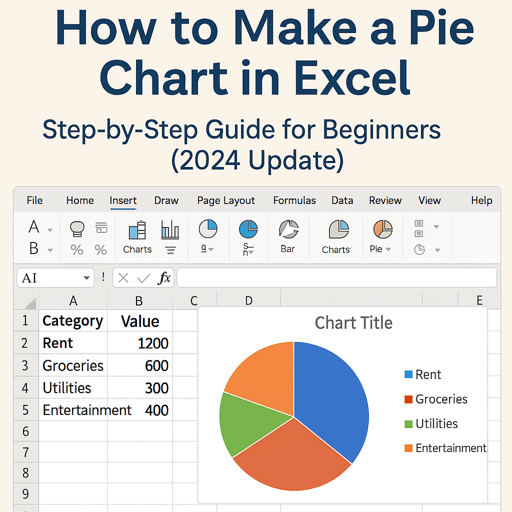
Example:
| Category | Value |
|---|---|
| Rent | 1200 |
| Groceries | 600 |
| Utilities | 300 |
| Entertainment | 400 |
Ensure no blank rows or columns within your data range to avoid chart errors.
Creating a Basic Pie Chart in Excel
Selecting Your Data
- Open your Excel spreadsheet.
- Highlight the category and value columns (e.g., A1:B5).
Inserting the Pie Chart
- Click the Insert tab on the ribbon.
- Under Charts, select the Pie Chart icon.
- Choose 2-D Pie from the dropdown.
Voilà! Your pie chart appears on the spreadsheet.
Customizing Chart Title and Labels
- Click on the default chart title to rename it.
- Right-click the chart and select Add Data Labels to show exact values or percentages.
- Use the Format tab to fine-tune fonts, styles, and alignment.
Customizing Your Pie Chart
Changing Chart Colors and Styles
Excel provides built-in color themes. To change them:
- Click on the chart.
- Go to the Chart Tools Design tab.
- Select a style from Chart Styles or customize colors via Format.
Exploding Slices for Emphasis
To make a slice stand out:
- Click on the slice you want to separate.
- Drag it slightly outward.
This “explodes” the slice, drawing attention to it.
Adding Data Labels and Percentages
- Click your chart.
- Choose Add Chart Element > Data Labels > More Data Label Options.
- Check the Percentage box for clearer context.
Using the Chart Tools for Advanced Editing
Design Tab Functions
- Change the chart type.
- Switch rows/columns.
- Move the chart to another sheet.
Format Tab Enhancements
- Apply shape effects like shadows or glows.
- Adjust text boxes and borders.
- Change individual slice formatting.
Working with 3D Pie Charts
How to Create a 3D Pie Chart
- Select your data.
- Go to Insert > Pie Chart > 3-D Pie.
Pros and Cons of 3D Visualization
Pros:
- Adds visual appeal.
- Highlights segments more clearly.
Cons:
- Can distort proportions.
- Might be hard to interpret small values.
Exploding a Slice in Your Pie Chart
Highlighting a Slice
To focus on one segment:
- Click on a slice.
- Drag it outward using the mouse.
Using the “Explode” Feature
For uniform explosion:
- Click the chart.
- Right-click and choose Format Data Series.
- Use the Point Explosion slider to separate all slices equally.
Grouping Small Values into ‘Other’ Category
When and Why to Group
If your chart has too many small slices, consider grouping them into an “Other” category. This improves readability and impact.
How to Manually Group Data
- Identify small categories.
- Sum their values.
- Replace individual entries with a single “Other” row in your data.
Best Practices for Pie Chart Design
- Limit categories to 5–7 for clarity.
- Use contrasting colors.
- Avoid using pie charts for complex data.
- Always label slices or include a legend.
Saving and Sharing Your Pie Chart
Exporting Your Chart
- Right-click on the chart and choose Save as Picture.
- Save in PNG, JPEG, or BMP format.
Inserting Charts into Word and PowerPoint
- Copy the chart (Ctrl + C).
- Paste (Ctrl + V) directly into your document or presentation.
Dynamic Pie Charts with Excel Tables
Using Structured References
Turn your data into a table:
- Select your range.
- Press Ctrl + T.
This allows Excel to auto-update the chart when data changes.
Making Your Charts Responsive to Data Changes
After converting to a table, adding or removing rows will instantly reflect in the chart without manual updates.
Troubleshooting Common Issues
- Chart Not Displaying: Ensure there are no empty cells or text in the value column.
- Label Overlaps: Adjust label positions manually or reduce text size.
- Data Formatting Errors: Format your value column as numbers.
Alternatives to Pie Charts
- Bar Charts: Better for exact value comparisons.
- Column Charts: Useful for showing trends over time.
- Doughnut Charts: Similar to pie charts, but support multiple data series.
Real-Life Use Cases of Excel Pie Charts
- Business Reports: Show revenue distribution by product.
- Academic Projects: Display survey results.
- Personal Finance: Track monthly expense categories.
External Tools That Enhance Excel Charts
- Lucidchart: For interactive charts.
- Think-Cell: Ideal for presentations.
- Power BI Integration: Dynamic dashboards using Excel data.
FAQs on How to Make a Pie Chart in Excel
1. Can I create a pie chart with multiple data series?
No, standard pie charts support only one data series. For multiple series, consider a bar or column chart.
2. How do I display percentages instead of raw numbers?
Click the chart > Add Data Labels > Format Data Labels > Check “Percentage”.
3. Why is my pie chart not showing all slices?
Some values may be too small or zero. Combine them into an “Other” category or adjust label visibility.
4. How do I animate my pie chart in PowerPoint?
Copy the chart to PowerPoint, then use the Animations tab to apply entry effects.
5. Can I make a pie chart from a pivot table?
Yes. Just select your pivot table summary and insert a pie chart as usual.
6. Is it possible to automate pie chart creation in Excel using VBA?
Absolutely. With a few lines of VBA code, you can generate pie charts dynamically.
Conclusion and Final Tips
Creating a pie chart in Excel is a breeze once you understand the basics. Whether you’re highlighting key expenses, showing survey results, or presenting business insights, pie charts remain one of the most accessible and effective ways to visualize data.
Practice with sample data, explore customization tools, and keep design best practices in mind for clean, professional charts.


Leave a Reply